FRANCA Studio.
THE BRIEF
FRANCA Studio had a clear product vision, sculptural 3D-printed lighting and objects that merge art and function through a refined, sustainable lens. What was missing was a defining asset: a mark capable of holding the brand’s modern minimalism while expressing the fluidity and movement inherent in the work. The task was to create a monogram that could anchor and elevate the entire identity.
THE PROCESS
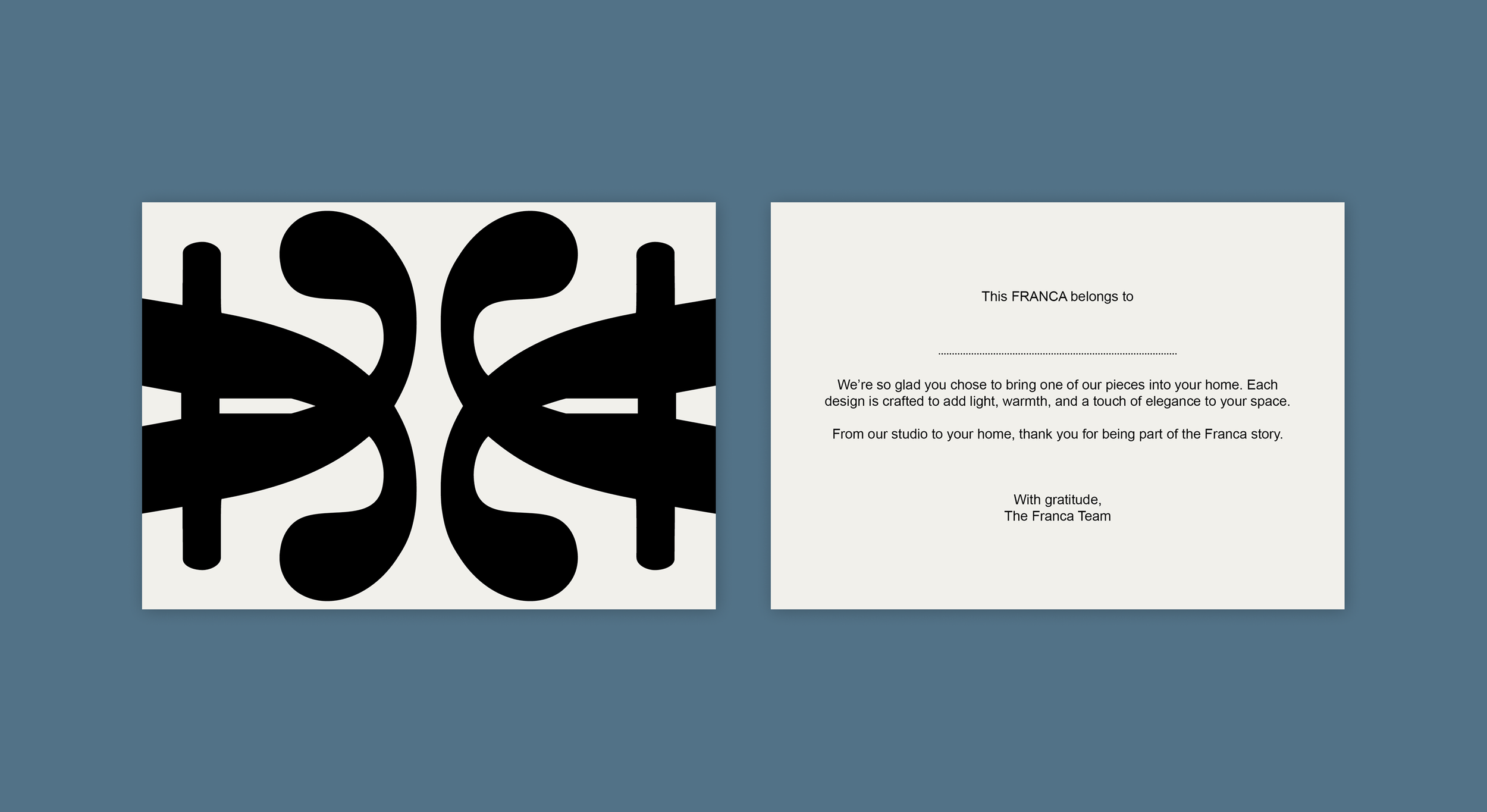
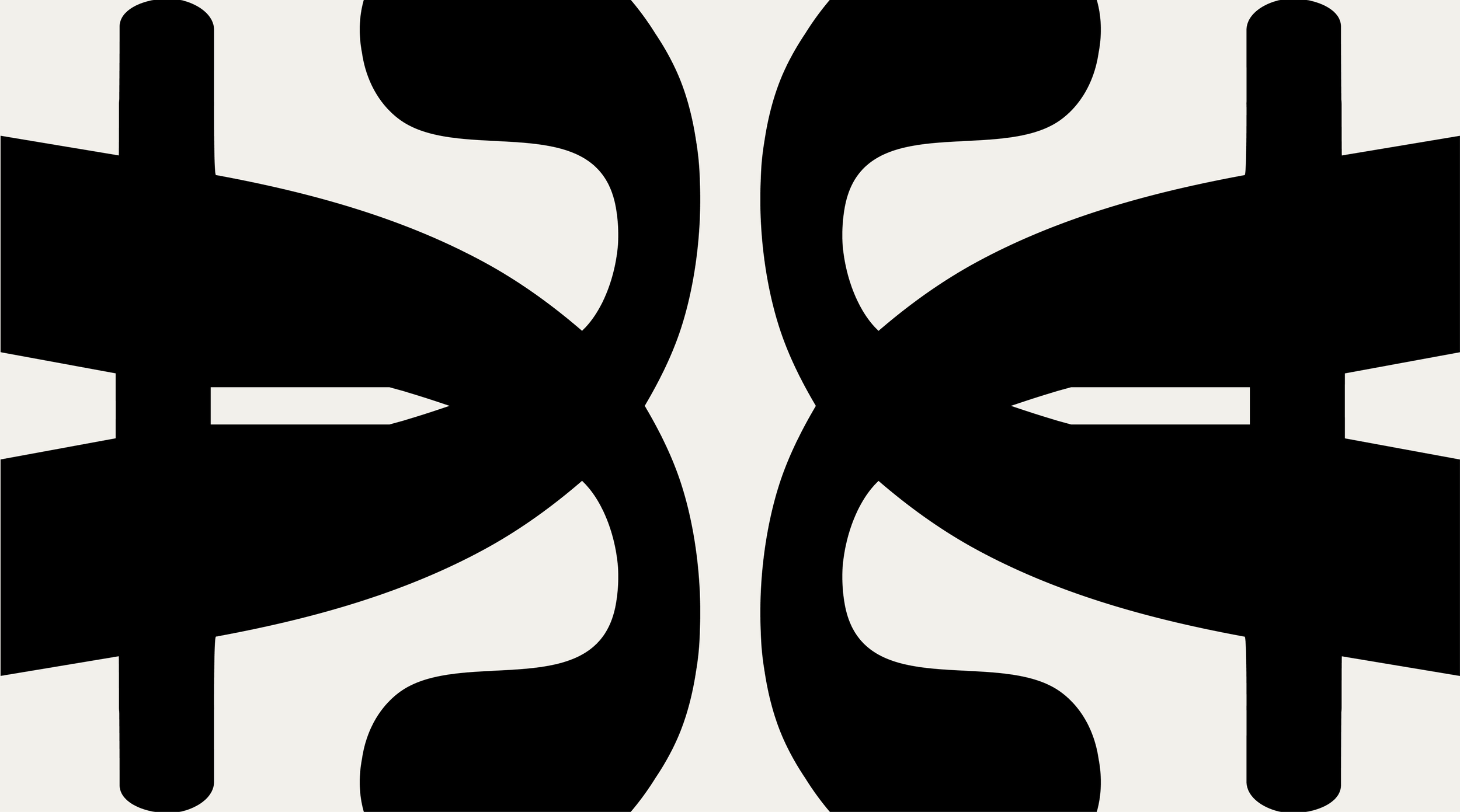
We treated the monogram as a distillation of FRANCA's philosophy rather than a decorative solution. Letterforms were constructed with architectural clarity, then softened through deliberate curves that echo the movement and lightness of the collection itself. The result is a geometric mark that is precise without being rigid. Fluid without being decorative.
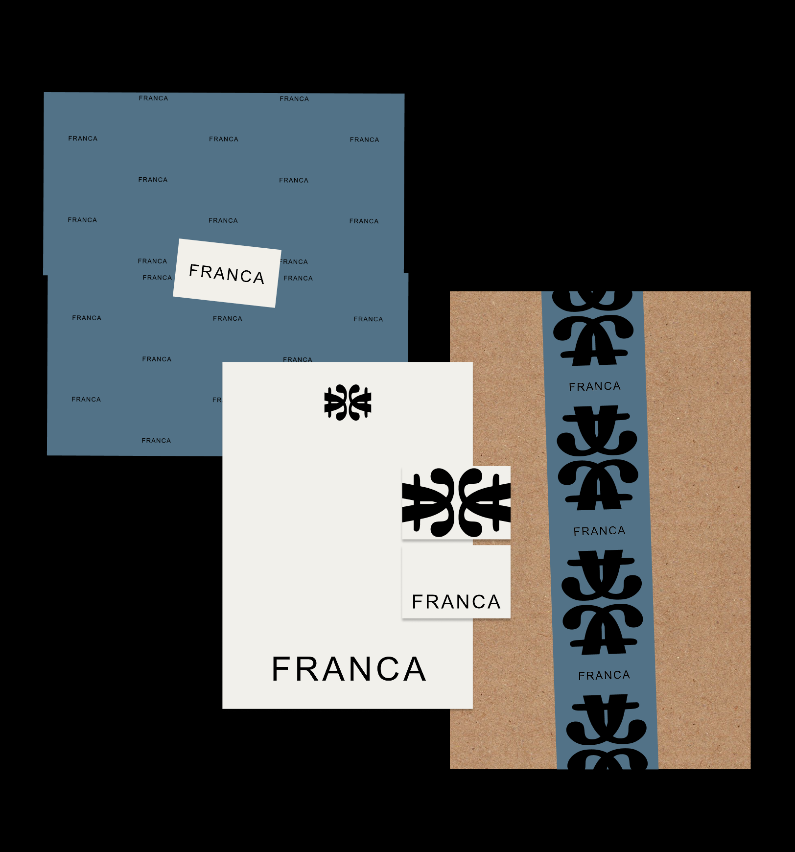
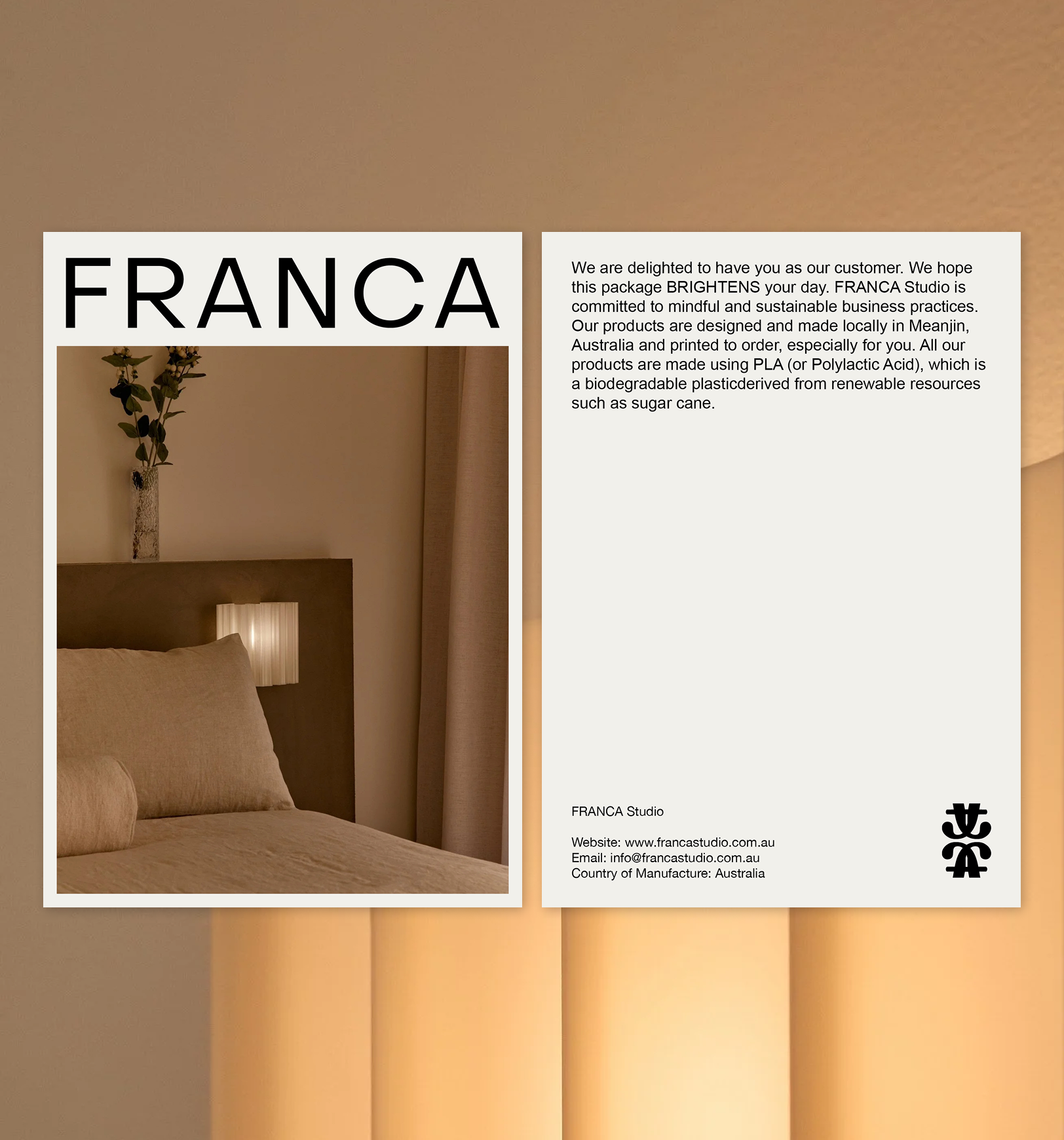
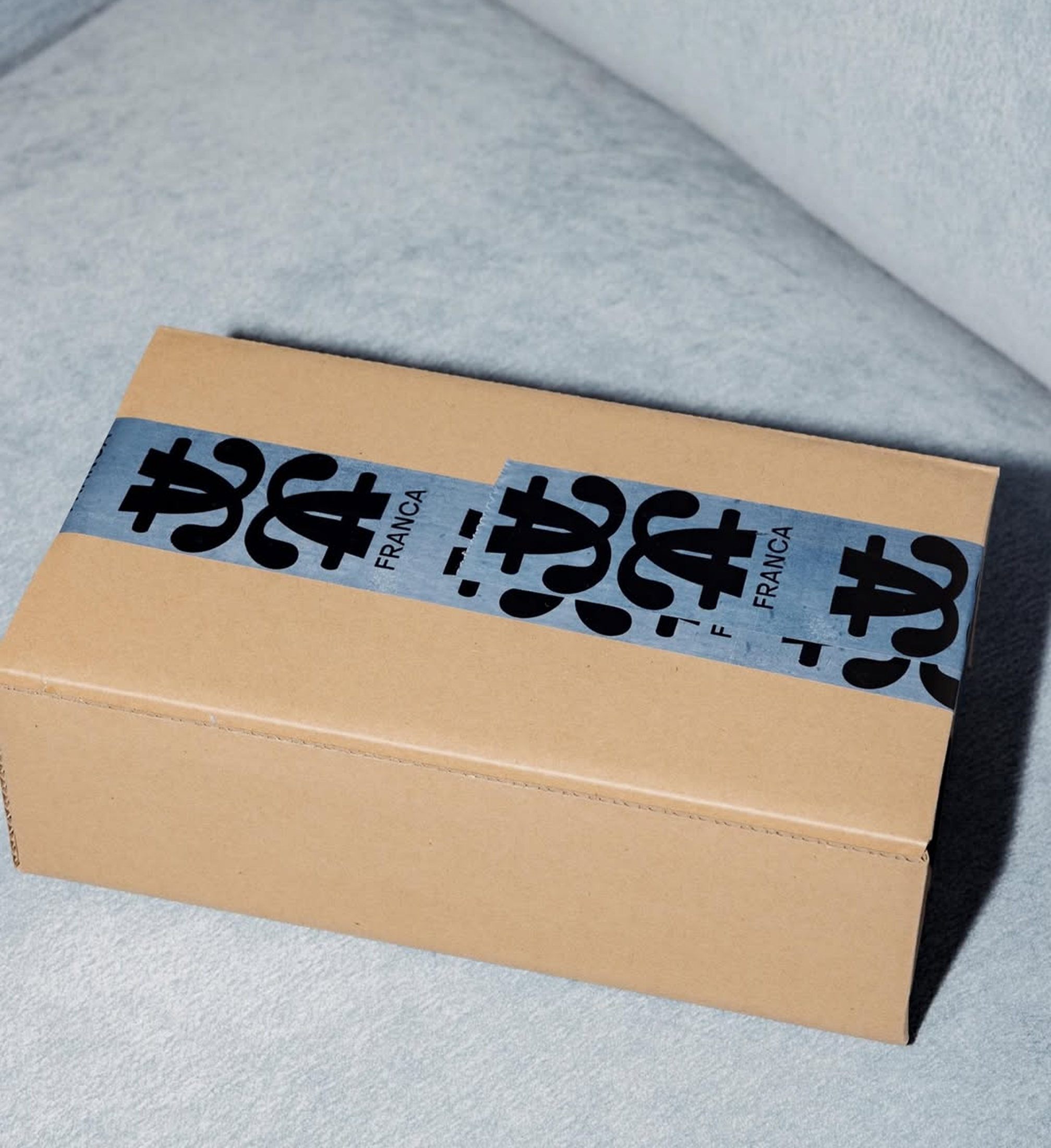
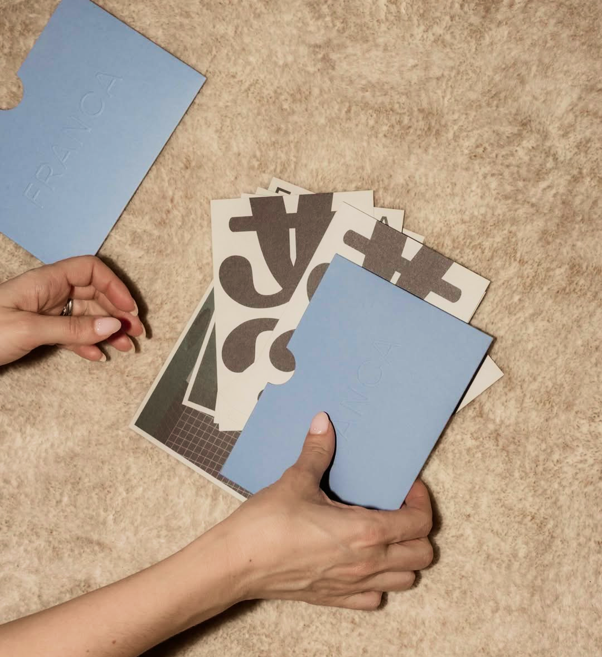
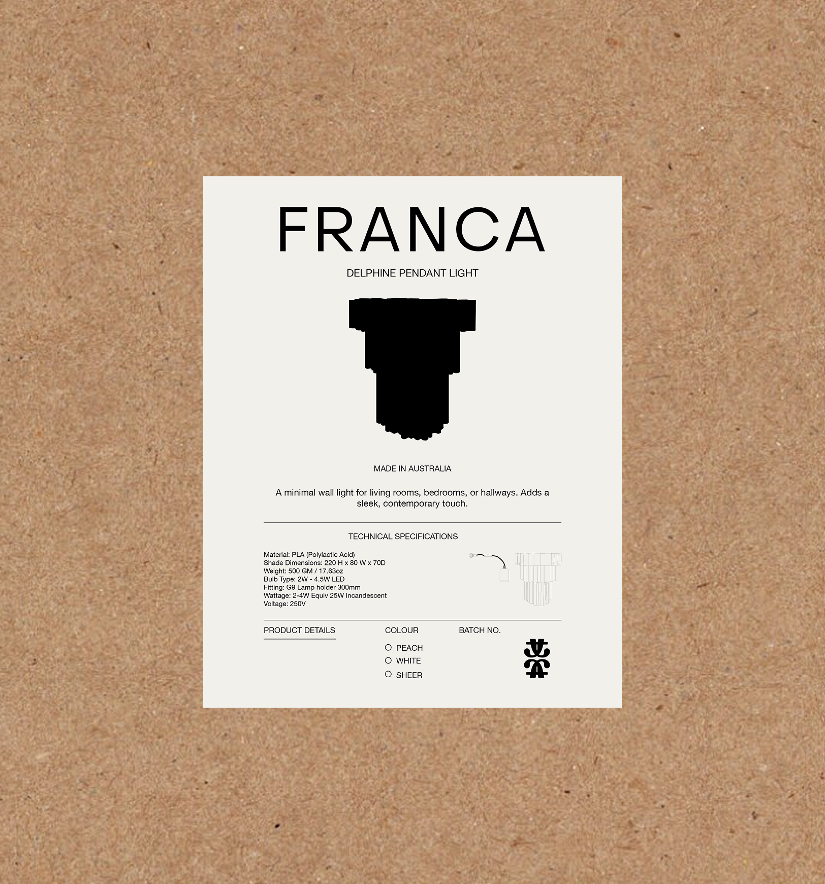
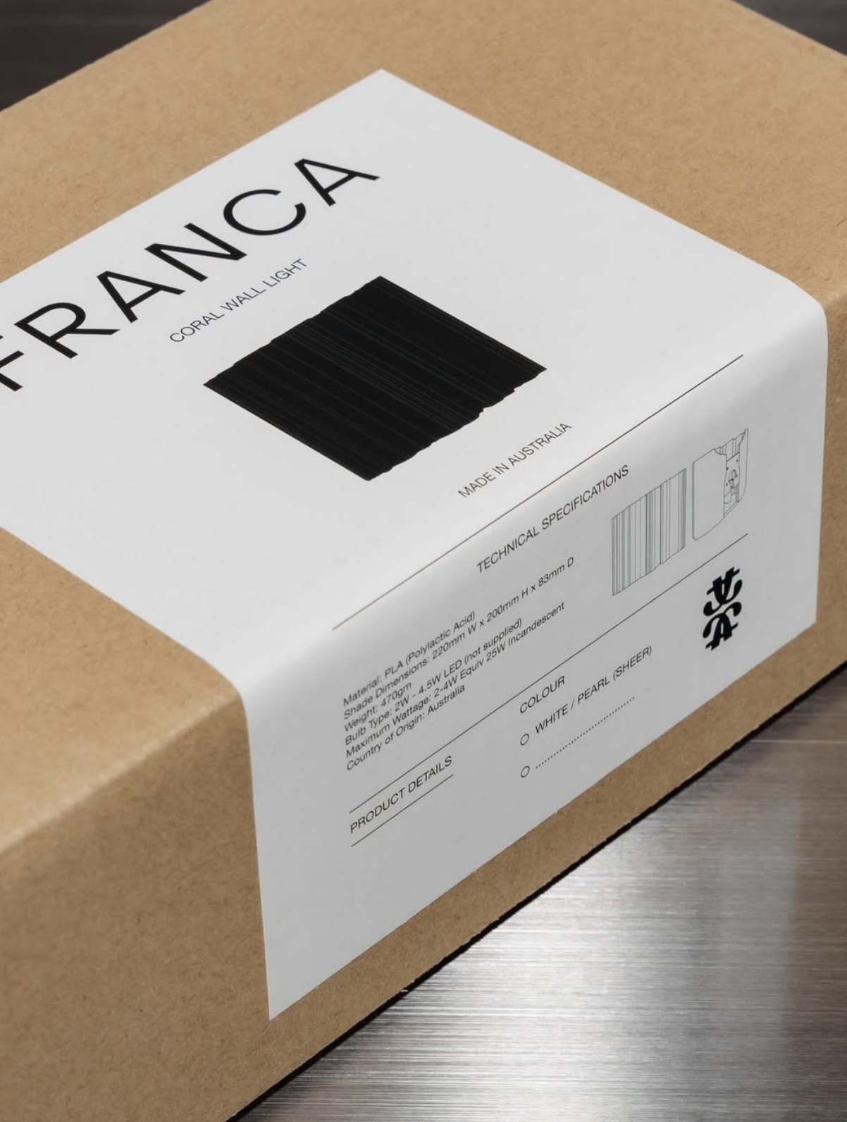
It functions not only as a logo but as a modular symbol system, built to scale across print and packaging without losing presence. Printed collateral extended this language through structured layouts and generous negative space. The monogram leads. Everything else supports it.
THE RESULT
A brand that now commands the room before a word is spoken. FRANCA has a recognisable signature, a visual centre of gravity, and an identity that elevates perceived value in a market where aesthetic authority directly influences purchase decisions and stockist interest. The work is no longer carrying the brand. The brand is carrying the work.
Scope
Monogram
Printed Collateral
Packaging
@_francastudio_