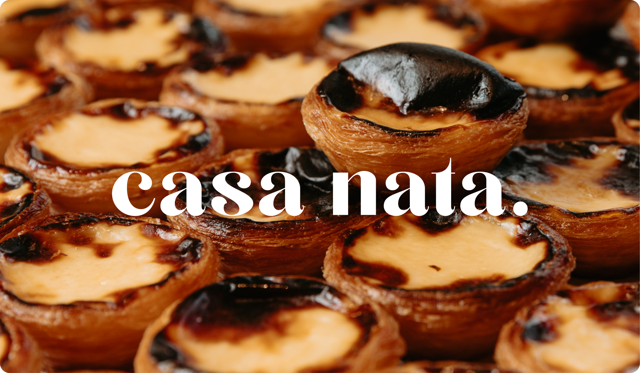
Casa Nata.
THE BRIEF
When Nelson and Rueben came to us with the vision for Casa Nata, the brief was clear: bring the genuine legacy of Portuguese food, art, and café culture to life in a way that felt authentic, not imitated. Melbourne's first dedicated Portuguese tart café deserved a brand to match.
The Process
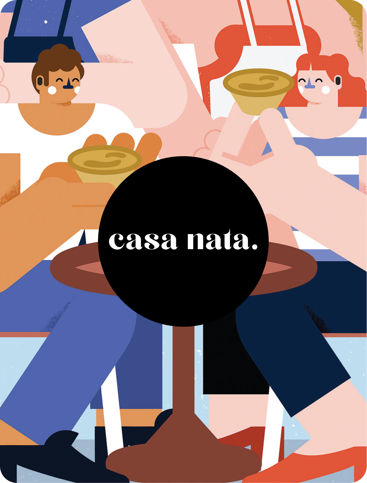
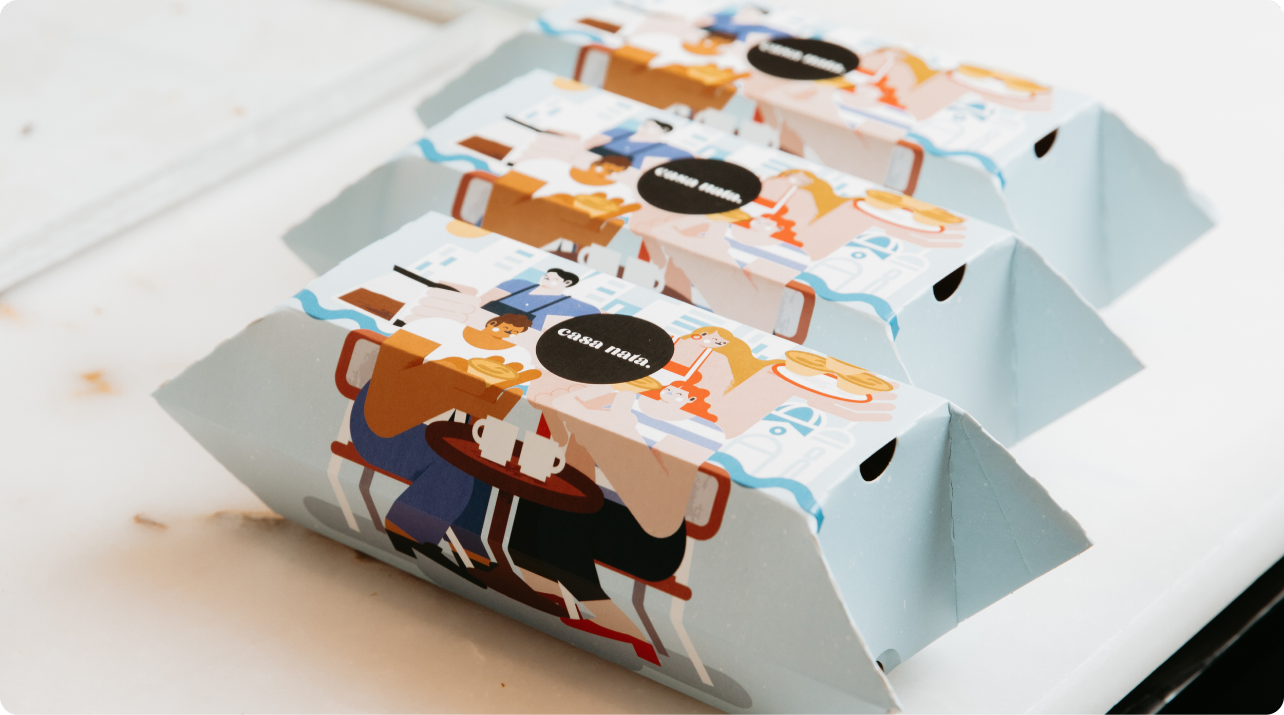
We built the visual identity through typography, pattern, and packaging design rooted in Portuguese tradition. Then we collaborated with Lisbon-based artist @tiago.galo to create a suite of original illustrations for the bespoke tart boxes. Packaging that earns its place on the kitchen bench long after the tarts are gone.
THE RESULT
A brand as considered as the product inside it. Casa Nata launched with an identity that resonated immediately, driving destination visits across both Thornbury and Windsor locations and creating the kind of shareability that no paid media budget can manufacture.
This is what happens when great food meets a brand built to match it.
@casanata.melbourne | Now open in Thornbury and Windsor.
Scope
Branding
Packaging
Website
Contributors
Tiago Galo / Illustrator
@taigo.galo.